-
Starting today August 7th, 2024, in order to post in the Married Couples, Courting Couples, or Singles forums, you will not be allowed to post if you have your Marital status designated as private. Announcements will be made in the respective forums as well but please note that if yours is currently listed as Private, you will need to submit a ticket in the Support Area to have yours changed.
-
CF has always been a site that welcomes people from different backgrounds and beliefs to participate in discussion and even debate. That is the nature of its ministry. In view of recent events emotions are running very high. We need to remind people of some basic principles in debating on this site. We need to be civil when we express differences in opinion. No personal attacks. Avoid you, your statements. Don't characterize an entire political party with comparisons to Fascism or Communism or other extreme movements that committed atrocities. CF is not the place for broad brush or blanket statements about groups and political parties. Put the broad brushes and blankets away when you come to CF, better yet, put them in the incinerator. Debate had no place for them. We need to remember that people that commit acts of violence represent themselves or a small extreme faction.
You are using an out of date browser. It may not display this or other websites correctly.
You should upgrade or use an alternative browser.
You should upgrade or use an alternative browser.
[MOVED from AP]2014 Warmest Year on Record Since 1880
- Thread starter DaisyDay
- Start date


EdwinWillers
Well-Known Member
- Jan 13, 2010
- 19,443
- 5,258
- Country
- Niue
- Faith
- Christian
- Marital Status
- Married
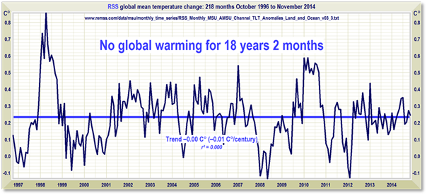
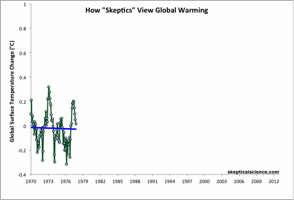
Cute....[serious];66943633 said:http://www.skepticalscience.com/graphics/Escalator_2012_1024.gif
But that 42 year period in your cutesy little graph?
...it'll fit inside the little white line above the 0 at the far right of this one (3 or 4 times in fact):

*That's* how skeptics really view global cooling/warming/climate changing/not changing.... and why
Upvote
0
*That's* how skeptics really view global cooling/warming/climate changing/not changing.... and why
I think when you said "skeptic" up there you misused the word. What you probably meant was: "people who don't know the science and probably never bothered to take even a single geology class" view the topic.
Hope that helps!
")
Upvote
0
EdwinWillers
Well-Known Member
- Jan 13, 2010
- 19,443
- 5,258
- Country
- Niue
- Faith
- Christian
- Marital Status
- Married
Actually what I meant was people who are able to read even the simplest of graphs.I think when you said "skeptic" up there you misused the word. What you probably meant was: "people who don't know the science and probably never bothered to take even a single geology class" view the topic.
Hope that helps!
For what it's worth, it doesn't take a "climate scientist" or even someone with a geology class under their belt to read what is a very simple graph - let alone to go through even the simplest of exercises to figure out where years 0-42 (1970 to 2012) lie on the graph I posted. I daresay anyone having passed grade school could do that.
As an aside, I actually respect those who've undertaken to get science or engineering degrees - as I should - being one of those people.
Arguments against skeptics such as I've seen here don't exactly elevate engineers and scientists - they in fact denigrate them - treating them like idiots and morons who can't even interpret the simplest of graphs - graphs, btw, their efforts generated.
Please don't treat climate scientists like that. It's really not fair to them, or to your argument.
Upvote
0
Actually what I meant was people who are able to read even the simplest of graphs.
Oh so you are saying you don't care about the meaning of said graphs just your "impression" of them?
Because anyone whose had even an intro geology class is not surprised by the graph and knows that scientists actually have some pretty solid understanding of why the temperature fluctuates naturally.
The illogic behind your position is to assume that since it has shifted before it can't possibly be due to a NEW forcing mechanism (human activities).
You probably don't know this but the REASON we know so much about the HUMAN IMPACT of the past 150 years is because we know the earlier temperature shifts and we have a better understanding of natural variation so we can better understand that the CURRENT changes are likely not due as much to natural forcings.
I understand that this subtlety is lost on many.
For what it's worth, it doesn't take a "climate scientist" or even someone with a geology class under their belt to read what is a very simple graph
But it does take a climate scientist or a geologist to EXPLAIN what that graph really means. Again, if this is not your area it is understandable that your "simple" reading of the graph might miss key points.
As an aside, I actually respect those who've undertaken to get science or engineering degrees - as I should - being one of those people.
So it is more surprising that you don't understand the detalis behind such graphs. Or the illogic of your "post hoc ergo propter hoc" view.
Arguments against skeptics such as I've seen here don't exactly elevate engineers and scientists - they in fact denigrate them - treating them like idiots and morons who can't even interpret the simplest of graphs - graphs, btw, their efforts generated.
If you plopped a physics graph, say a Feynman diagram in front of me I wouldn't necessarily know how to read it in detail.
But you put an earth science graph in front of me I can say there's more than a simple read to it.
Please don't treat climate scientists like that. It's really not fair to them, or to your argument.
I doubt you are a climate scientist. If you were you'd know what this graph actually tells you about the state of the science.
Upvote
0
EdwinWillers
Well-Known Member
- Jan 13, 2010
- 19,443
- 5,258
- Country
- Niue
- Faith
- Christian
- Marital Status
- Married
Well, what I said was perfectly clear, and *that* misrepresentation of it isn't remotely close to what I clearly said. So's Law strikes again.Oh so you are saying you don't care about the meaning of said graphs just your "impression" of them?
Oooh - condescension. That's usually the first sign of someone who knows they're losing an argument. (Just sayin...)Because anyone whose had even an intro geology class is not surprised by the graph and knows that scientists actually have some pretty solid understanding of why the temperature fluctuates naturally.
Actually, I didn't assume anything of the kind. What is it you think I said that required something I never assumed in the first place?The illogic behind your position is to assume that since it has shifted before it can't possibly be due to a NEW forcing mechanism (human activities).

LOL - whatever.You probably don't know this but the REASON we know so much about the HUMAN IMPACT of the past 150 years is because we know the earlier temperature shifts and we have a better understanding of natural variation so we can better understand that the CURRENT changes are likely not due as much to natural forcings.

Oooh, ooh - more condescension. Not a good sign, my friend. Not a good sign.I understand that this subtlety is lost on many.
Well, let's see - there's temperature on the vertical axis and time on the horizontal axis of one graph; and there's CO2 levels on the vertical axis and time on the horizontal axis of the other graph.But it does take a climate scientist or a geologist to EXPLAIN what that graph really means. Again, if this is not your area it is understandable that your "simple" reading of the graph might miss key points.
Are you suggesting that there's more to the first graph than the change in CO2 over time?
And are you suggesting that there's more to the second graph than the change in temperature over time?
What is this "less-than-simple" mystical reading of either graph that you think it is I - or anyone else for that matter - is missing because we're too stupid or too uneducated to grasp the "true" meaning of either graph?
LOL -So it is more surprising that you don't understand the detalis behind such graphs. Or the illogic of your "post hoc ergo propter hoc" view.
Well that's odd - are you telling us you don't even *know* how to read a graph?? I mean seriously - is it your contention that the two graphs of Temperature vs. Time and CO2 vs. Time are even REMOTELY similar to a Feynman diagram? Have you ever even seen a Feynman diagram? How is it you'd make a comparison of these graphs to a Feynman diagram anyway?If you plopped a physics graph, say a Feynman diagram in front of me I wouldn't necessarily know how to read it in detail.
Ah, so you CAN read a basic graph! Whew!But you put an earth science graph in front of me I can say there's more than a simple read to it.
I'll ask you again - you have the Temp vs. Time and CO2 vs. Time graphs in front of you, what is the "more than simple read" to them?
Indeed, what DID I say - or more precisely - what did I ask? I asked where on those graphs the 42 year span of data that [serious] posted would overlay? Isn't that what I asked? I'm pretty sure it is what I asked, being as those are the words I used and constructed into the sentence I did. Didn't I?
You apparently have some special insight however into the real reasons why I posted it. I'd be interested in knowing what those reasons are; I'd be even more interested in knowing how you came to such knowledge of my motives.
Don't doubt - know that I am not a climate scientist. Goodness, where did you get the idea I was??I doubt you are a climate scientist. If you were you'd know what this graph actually tells you about the state of the science.
And frankly, what does my being or not being a climate scientist have to do with what I posted - unless of course only climate scientists are capable of interpreting graphs of Temp vs. Time and CO2 vs. Time. Is that your contention?
Out of curiosity - are you able to show us where on either graph - either the graph showing CO2 vs. Time or the one showing Temp vs. Time - where the 42 year period of 1970 to 2012 lie? Might you be able to do that for us?
I tell you what - I'll give you a hint - "0" on both graphs represents the year 1950, so we're going to have to extrapolate a little bit, since 1970 to 2012 will of necessity lie to the right of the "0" on both graphs. To do that, it's probably easiest to expand our time frame from 1950 (year "0") to 2012 - making a 62 year span of time instead of 42. With me so far? Good.
Ok, now what we need to do is recognize that the first identified time to the left of the year 0 is the year 50,000 - which is five "ticks" to the left of the 0. That means that each one of those ticks represents 10,000 years. Make sense?
Since the question is where we'd place that 62 year time span on the graph, we need some mechanism of measure to do that. Let's pick one - let's say that the distance from 0 to 50,000 is 1 centimeter (1/100th of a meter) - which btw, is visually a fair approximation of the actual distance, depending on one's monitor size. Given that, then the first tick (10,000 years) is one fifth that distance, or 1/5th of a centimeter, or 1/5th of 1/100th of a meter - or, 1/500th of a meter. Would you concur?
Now, the hard part. What is the distance represented by our 62 year span of time? Well, 62 years divided by 10,000 years is 62/10,000 or 0.0062 - correct?
Now, since 10,000 years is one tick on the graph and one tick is 1/5th of a centimeter, then our 62 year period is 0.0062 of that, right?
Or, our 62 year period is 0.0062 fifths of a centimeter or 0.0062/5. Still with me?
0.0062/5 = 0.00124 Centimeters
That's a little hard to visualize so let's convert that to millimeters.
We know that there are 10 millimeters in a centimeter, so we can multiply that value by 10 to convert it to millimeters.
10 x 0.00124 = 0.0124 millimeters. Even that is difficult to visualize, so let's take something a little more common - let's take the average diameter of a human hair, which varies from about 0.04 mm to 0.25 mm. Let's pick an easy one somewhere in the middle for math's sake and say the avg human hair is 0.124 mm in diameter, ok? I hope the reason for that value will be obvious in a sec...
Well, 0.0124 mm represents our 62 year time span and 0.124 mm is the width of the average human hair.
I think if one does the math from here that we can see that 620 years on that graph is roughly the width of a human hair, and therefore our 62 year time span one tenth the diameter of a human hair - correct?
So, take a human hair - slice it into ten equal widths - take one and lay it on that graph and voila! There's [serious]'s graph overlaid on mine.
Upvote
0
Oooh - condescension. That's usually the first sign of someone who knows they're losing an argument. (Just sayin...)
Except I actually have more experience with this sort of thing. You'd be mistaken. I get condescending when I respond to someone who is condescending. You make it sound like everyone except YOU is too stupid to understand a graph.
^^^^^THIS! THIS IS WHY YOU DESERVE CONDESCENSION^^^^LOL - whatever.
Let me help you. There is a thing called PALEOCLIMATOLOGY and PALEOECOLOGY. These fields of study make scientists look at the factors preserved in the geologic record and helps them understand the conditions in which that record was laid down.
Unless you understand these concepts you will not understand why the current discussion is important.
This is all I need to know about your "general acquaintance" with the topic.
LEARN THE SCIENCE EDWIN.
Sheesh!
Anyone whose done even a MODICUM of geology would understand that what we see in the record helps us understand how NATURAL FORCINGS WORK.
That allows us to understand how the current warming is different and is probably due to us and our actions.
The graph you like to post all the time shows a lot of time in which humans didn't even exist!
ALmost no one on here thinks all life will be destroyed with AGW (although it came close back in the end_Permean when NATURAL CO2 fluxes helped wipe out almost all of life on earth...but in general I doubt we'll destroy all life. ALL WE HAVE TO DO IS DECIMATE OUR ECONOMY AND SOCIETY to have a significant impact.
Hypocrite:Oooh, ooh - more condescension. Not a good sign, my friend. Not a good sign.
Cute....
But that 42 year period in your cutesy little graph?
Actually what I meant was people who are able to read even the simplest of graphs.
So condescending AND a hypocrite! Not a good sign my friend, not a good sign.
The fact that you are clearly unfamiliar with how we understand PALEOCLIMATE and the various forcings.What is this "less-than-simple" mystical reading of either graph that you think it is I - or anyone else for that matter - is missing because we're too stupid or too uneducated to grasp the "true" meaning of either graph?
LOL -
Last edited:
Upvote
0
Here, let's look at an example involving the DETAILED information behind the graph:
Let's look at your favorite graph using knowledge of what earth scientists have known for decades now:
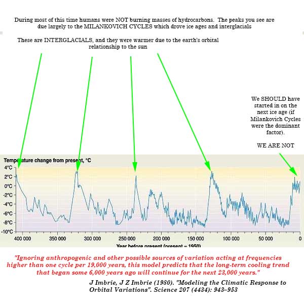
The point being that you can't just simply marvel at the big swooping cycles and assume that the cycle NOW isn't a problem. It's a BIG problem. WE, humans, HAVE APPARENTLY ALTERED THE NORMAL PATH OF EARTH TEMPERATURES WITHOUT EVEN REALIZING WE'D DONE IT
Does that make you feel safer now?
Or could it possibly mean we are messing with things beyond our ability to control?
Let's look at your favorite graph using knowledge of what earth scientists have known for decades now:
The point being that you can't just simply marvel at the big swooping cycles and assume that the cycle NOW isn't a problem. It's a BIG problem. WE, humans, HAVE APPARENTLY ALTERED THE NORMAL PATH OF EARTH TEMPERATURES WITHOUT EVEN REALIZING WE'D DONE IT
Does that make you feel safer now?
Or could it possibly mean we are messing with things beyond our ability to control?
Upvote
0
How PALEOCLIMATOLOGY helps us understand the current warming we are seeing:
NOAA Paleoclimatology Group
Climate Sensitivity Estimates from Paleoclimate (LGM) Data
(Edwin, in case you don't understand this, "Climate sensitivity" is the technical term for how much of a temperature increase can be expected from a doubling of a given greenhouse gas, like CO2).
Knutti and Hegerl (2008) this article (sorry it is technical again) shows how the estimate of climate sensitivity for various greenhouse gases like CO2 align, some use paleoclimate data.
WHY IS THIS IMPORTANT?
1. Because when you look at the earth's history of climate change we need to understand WHY it changed.
2. Humans have not always existed.
3. Humans clearly CAN AND ARE having an impact on the climate. We know this because the USUAL "natural forcings" that we know about from paleoclimate data don't seem to be able to account for the current warming.
YES the earth has warmed and cooled before. That does NOT mean that we can't and don't have any impact on the climate NOW.
Clearly we DO.
If you just look at a graph of the earth's history without understanding what the graph is telling you in way of background information you may be missing the key points.
If you can make it through all this then maybe you can understand why it is GOOD to understand EARTH SCIENCE before trying to look at a pretty graph and misinterpretting what it tells you.
Upvote
0
.Because anyone whose had even an intro geology class is not surprised by the graph and knows that scientists actually have some pretty solid understanding of why the temperature fluctuates naturally.
The illogic behind your position is to assume that since it has shifted before it can't possibly be due to a NEW forcing mechanism (human activities).
You probably don't know this but the REASON we know so much about the HUMAN IMPACT of the past 150 years is because we know the earlier temperature shifts and we have a better understanding of natural variation so we can better understand that the CURRENT changes are likely not due as much to natural forcings.
Your statements above are erroneous.
You know better than to state such misinformation.
One simple example: no AGW scientist saw the "Pause Coming".
.
Upvote
0
.
Your statements above are erroneous.
You know better than to state such misinformation.
One simple example: no AGW scientist saw the "Pause Coming".
.
Please show me the pause again, thanks!
You may not know this but the statistical significance of very short blocks of a time series dataset can often fail to show trends.
(I know, this is "statistics" and that is hard. So feel free to ignore the importance of statistics when it becomes too hard!)
Upvote
0
.
Your statements above are erroneous.
You know better than to state such misinformation.
One simple example: no AGW scientist saw the "Pause Coming".
.
You know what would be devistating to your point? If 7 years ago there was a peer reviewed paper predicting the pause. One that was then covered by a major media source. And then, I don't know, linked to on this site. By me.
http://www.christianforums.com/t7218483/
Hey, I even predicted that climate deniers would try and say that it disproved global warming!
Upvote
0
.Please show me the pause again, thanks!
You may not know this but the statistical significance of very short blocks of a time series dataset can often fail to show trends.
(I know, this is "statistics" and that is hard. So feel free to ignore the importance of statistics when it becomes too hard!)
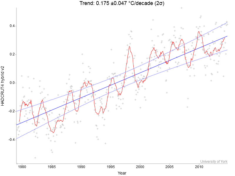
And by trying to prove me wrong by "tweaked graphs" that starts in 1980 you have proved"No Pause", that even the Climate Elite of CAGW have faced up to, even James Hansen?
Go figure. More misinformation, and you know it.
No, you have continued in "Elite-ism", talking downwards to others as mentioned to you many months ago and why I do not reply to your posts. For example, look at your last sentence above.
.
Upvote
0
1. Is there something special about the 80s that make them a bad start point? I haven't seen you complain about the ones starting in 98 or the ones starting hundreds of thousands of years ago..
And by trying to prove me wrong by "tweaked graphs" that starts in 1980 you have proved"No Pause", that even the Climate Elite of CAGW have faced up to, even James Hansen?
Go figure. More misinformation, and you know it.
No, you have continued in "Elite-ism", talking downwards to others as mentioned to you many months ago and why I do not reply to your posts. For example, look at your last sentence above.
.
2. It starts in the late 70s
As far as tweaking, I'm just seeing a running average, a trend line, and a confidence range of 2 standard deviations.
The HadCRUT4 data is freely available online, and are not interpolated or variance adjusted.
If youwant to look at the source data, here you go:
Met Office Hadley Centre observations datasets
Let us know if you find any evidence of "tweaking"
Upvote
0
.
And by trying to prove me wrong by "tweaked graphs" that starts in 1980 you have proved"No Pause", that even the Climate Elite of CAGW have faced up to, even James Hansen?
My point, Heissonear, is that calling a "pause" in a shortened version of a time series data set is "weak tea" if you will.
I rather assume the pause is "real" in the same sense that there are a number of forcings in action and it's a noisy trend.
In the classic temperature over time graph there are a number of "pauses".
That does not ever seem to stop permanently the increase due to human activities though.
|
No, you have continued in "Elite-ism",
Am I "bad" for having taken the time to learn some of this stuff, including statistics?
I've heard that before. Statistics isn't the most "fun" thing and certainly requires work to understand. I used to dislike statistics then I started using them for my work and now I love stats. I've taken a lot of time to learn statistics.
So it is understandable that you'd dislike me for that. Learning is not for the lazy.
talking downwards to others
YOU are a hypocrite. You call everyone who disagrees with you everything short of "idiot". You call them "duped", you make it sound like they are on a "bandwagon" because they don't know any better.
Yet repeatedly YOU post misinformation which me, [serious] and others have to CONTINUALLY CORRECT!
So you complain about me talking downwards to you??? That's a laugh, Heissonear! YOU TREAT EVERYONE LIKE AN IDIOT and you don't think that's talking down to people????
as mentioned to you many months ago and why I do not reply to your posts
Because I know the rest of the story and I give the other side. You can't keep up because you don't even know the basics of this science!
THAT'S WHY YOU DON'T RESPOND TO MY POSTS!
I scare you.
Because I have a PhD in GEOLOGY.
And YOU CAN'T HANDLE TALKING TO A GEOLOGIST, Mr. Geochemist.
Upvote
0
eclipsenow
Scripture is God's word, Science is God's works
- Dec 17, 2010
- 10,227
- 2,710
- Country
- Australia
- Gender
- Male
- Faith
- Anglican
- Marital Status
- Married
Well let's see - will you at least agree that the proxy methodology we use to measure CO2 as far back as 800,000 years isn't remotely capable of proving or disproving the existence or non-existence of CO2 spikes within a given 134 year sliver of time (let alone a 1 to 10 year sliver) such that we can definitively assert what we think we're seeing today hasn't ever happened before?
Put differently, let's take a random 134 year period from... oh, -387,244 to -387,110. Can you tell me what the average level of CO2 was during that period?
Can you do it with the same accuracy as we can measure CO2 today?
Or, how about the CO2 level in year -387,115? Can you tell me whether the CO2 level that year was greater or less than the year -387,125? -387,124?
I ask because that *is* the sort of absurd, nonsensical assertion being made in this thread - albeit for the period of time from years -134 to 0.
You can draw whatever conclusions you want from the data - it's up to you; but I'm not buying it.
Will you agree that a Fourier device can measure the amount of thermal energy CO2 re-radiates?
Will you agree that we can accurately count how much CO2 is in the atmosphere now, and run the radiative forcing equation (mathematics) to work out it is trapping an extra 4 Hiroshima bombs / second, which across our very large planet works out to be about 1 Christmas tree light per meter?
Will you admit the seasons are changing with trees and bees doing their things earlier for Spring and winter arriving later? (Generally speaking, apart from 'Drunken Arctic' events in North America where global warming has destabilised the jet stream).
Will you agree that photographic evidence shows glaciers to be decreasing?
Will you agree that satellites also record the world's temperatures warming?
Will you agree that fire seasons around the world are changing, and droughts are getting worse, and that the physics of atmospheric hydrology allow an extra 5% moisture to be carried for every 1 degree of temperature increase?
Will you agree that the multi-year thick ice is retreating at the poles?
Will you agree with SCIENCE for once and stop projecting your political worldview all over the data so much that you can't even see it?
Upvote
0
Will you agree that .....
Global Warming is now so serious I am convinced that we will have to use SPICE** to save civilisation. Our grandchildren may be forced to paint the skies white! Blue skies may not be permitted for many centuries to come! Clean energy has been too little too late. We have failed. Our grandchildren will curse us for ignorant fools.
.
Alarmism ?
Yep.
Doom and Gloom?
Yep.
Scientifically factual ?
No.
When people fail to integrate GHG radiation physics into the thousands of other major climate-regulating factors, well, they lose perspective of the interconnected and interdependent relationships of the whole.
The above quote should teach people about Extremists and Alarmism: those that promote only one side, all the negatives, and their lack of first factoring out natural variability causation.
.
Upvote
0
.
Alarmism ?
So the First Law of Thermodynamics is now "alarmist"?
Doom and Gloom?
So Fourier and Tyndal's work in the 1820-1850's is now "doom and gloom"?
Scientifically factual ?
With the possible exception that we have known how greenhouse gases work for over 150 years now. But other than that...
When people fail to integrate GHG radiation physics into the thousands of other major climate-regulating factors
THE CLIMATE SCIENTISTS AGAINST WHOM YOU RAIL NON-STOP ALREADY DO THIS, HEISSONEAR.
READ THE LITERATURE. Even just ONE piece of the actual literature!
You have been exposed as misrepresenting the state of the climate science so many times on these threads is scary!
The above quote should teach people about Extremists and Alarmism: those that promote only one side, all the negatives, and their lack of first factoring out natural variability causation.
READ AN IPCC REPORT. EVEN THE FIRST ONE FROM 1991 AND YOU'LL SEE THAT ALL THE THINGS YOU CLAIM ARE "IGNORED" BY CLIMATE SCIENTISTS ARE NOT.
Upvote
0
Similar threads
- Replies
- 1
- Views
- 447
- Locked
- Replies
- 701
- Views
- 37K
- Replies
- 12
- Views
- 2K
- Replies
- 95
- Views
- 9K