- Dec 28, 2019
- 347
- 39
- 64
- Country
- United States
- Gender
- Male
- Faith
- Christian
- Marital Status
- Single
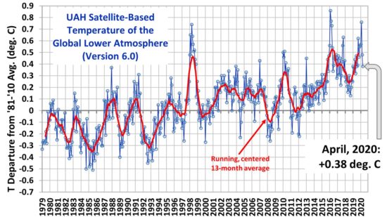
If you throw out the very warm El Nino year 1998, we have been at two and a half degrees warming average for twenty years.
This is the beginning of the global warming scare so much to early to say that the CO2 reductions worked. I am going to say that I believe the 23 Sun cycle following an even weaker 24 cycle is the best explaination.
What is your take on this ?
This is the beginning of the global warming scare so much to early to say that the CO2 reductions worked. I am going to say that I believe the 23 Sun cycle following an even weaker 24 cycle is the best explaination.
What is your take on this ?