- May 3, 2007
- 2,814
- 271
- Country
- United States
- Gender
- Male
- Faith
- Charismatic
- Marital Status
- Single
- Politics
- US-Republican

Signs that the modern warming period is ending.
I predict a big cooling again this winter.


Last edited:
Starting today August 7th, 2024, in order to post in the Married Couples, Courting Couples, or Singles forums, you will not be allowed to post if you have your Marital status designated as private. Announcements will be made in the respective forums as well but please note that if yours is currently listed as Private, you will need to submit a ticket in the Support Area to have yours changed.
Signs that the modern warming period is ending.
I predict a big cooling again this winter.

Are you honestly suggesting that a single year or even a decade of relatively cooler temperatures negates a couple of centuries of a cooling trend? The whole premise here is no better than saying that Atlanta was cooler than usual last week so we need to watch out for an ice age!
Climate trends are on the order of 5+ decades, so showing pretty graphs showing what happened last year and claiming it is evidence of a long-term trend is just dishonestly pandering to people who don't understand how short-term variation differs from long-term trends.
They don't think for themselves. They listen to people who tell them that the "smart" people are lying to them, and if they want to be free thinkers then they can't agree with the "smart" people. Unfortunately, the people they are listening to are utter frauds who are using them as pawns.
Personally, I feel sorry for them. I'm sorry that they can't accept that they are wrong, and that they may need to change their self indulgent lives for the betterment of all mankind.
A bit harsh, but perhaps true in terms of who they listen to.
What really gets me excited is that climate scientists have been developing a whole new category of models that follow oceanic effects that cycle on the order of a decade or so. Since 70+% of the energy absorbed by the Earth goes into the ocean (and we measure primarily surface atmospheric temperature) these models have a huge potential to increase our ability to predict the temperature and rainfall at the surface in 1-10 years.
Of course, SOME people see a 2-year prediction of cooler temperatures and start shouting that it somehow disproves existing climate models. Sometimes I think they don't even WANT to understand that the oceanic models don't contradict or replace long-term climate models or that oceanic effects like el nino or el nina that affect surface temperatures strongly over a 2-8 year cycle have very little effect on long term trends!
There's a ton of really amazing stuff we can learn about the world here, but some people just pick and choose so they can shout "scientists are stupid" from the rooftops.
The real fun comes when someone brings up global dimming. That's something that should terrify people. If I recall correctly, the earth temperature would be something like 2 to 4 degrees warmer on average without the dimming effect that particulate pollution has been having. Even if we do everything right from this point forward, as the particulate pollution in the atmosphere decreases the temperature will still keep going up and may spike as we decrease the pollution.
I'm pretty sure you don't recall correctly. Local temperature around some of the most polluted population centers will indeed probably rise a couple degrees if aerosol levels are decreased and the amount of energy hitting those cities increases a couple percent. However, overall it won't have anywhere near that much effect on global temperature.
It's certainly something worth mentioning because people in highly populated areas might see some warming if they decrease air pollution, but it won't have a huge effect on the amount of energy hitting the Earth's surface overall.
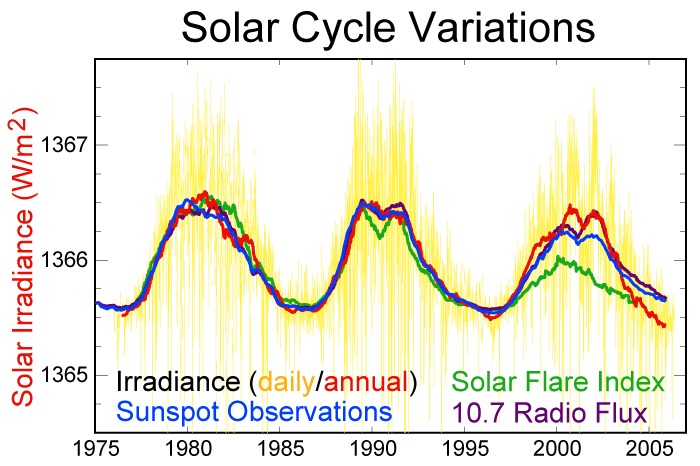
I'm afraid I haven't followed this area closely enough to have even general numbers, but I'm sure somebody has calculated how many W/m^2 increased aerosol levels have reflected away from the Earth. It's certainly been included in atmospheric models, but my impression is that it's around 0.01-0.1% of total flux -- measurable, but not significant on a world-wide scale (though potentially very significant near population centers where it can affect temperature and rainfall enough to matter).
The effect varies greatly over the planet, but estimates of the terrestrial surface average value are:
Erm.. Doesn't chart 3 flatly contradict "Seas are falling"? It's level seems to have increased since 2000 and has now plateaued.
Yep, the data presented is purposely distorted. This is a good example of why people don't trust statistics. And when somebody has an agenda, there is good reason to distrust it.I wasn't even going to go there, but yeah, in that case, it doesn't even LOOK like sea levels are trending downward. The graphs are all pretty misleading though -- on some, the recent change was in the past few months, on others, it's years or decades. On the global temperature graph, for example, go back another couple decades and it obviously looks like a long-term warming trend.
Cherry-picking data is good for convincing the masses, but it's not justifiable or useful in backing the conclusions claimed.
OutsideNormal -- thanks for the data.

")
I don't follow yearly temperature predictions enough to claim to represent scientists on this one but off-hand, I'd suspect this last year's la niña. It's really interesting that they carefully circled the el niño warming, but declined to circle this years la niña cooling in an attempt to deceive viewers.I know next to nothing about the GW debate, but even I; GW ignoramus extraordinaire, can easily tell that graphs 3, 6 and 7 are manipulative and seems to miss the point.
Yet, I wonder about some of the other graphs. I'm not interested in Greatcloud to answer me, as he appears to be too biased and ignorant to offer anything of value. But for you other guys, what's the temperature about in graph 2? From other graphs the data appears very different, like this one from wiki:
What explains the discrepancy?
No clue. I'd guess la nina again, but the graph only goes to 2005. I don't know enough about the cyclones or the counting to have anything intelligent to say here.And what's with the cyclones data? Would it show differently if data from more than just Australia was included?
A comment on graph 4 would also be appreciated.
Peter
Just looked it up on wiki (http://en.wikipedia.org/wiki/Global_dimming) for just some basic numbers, and according to the entry the average amount of solar radiation reaching the earth has decreased by 10% over the last three decades. The W/m^2 numbers that they list are
[/list]