- Mar 16, 2018
- 1,628
- 1,439
- Country
- United States
- Faith
- Non-Denom
- Marital Status
- Married
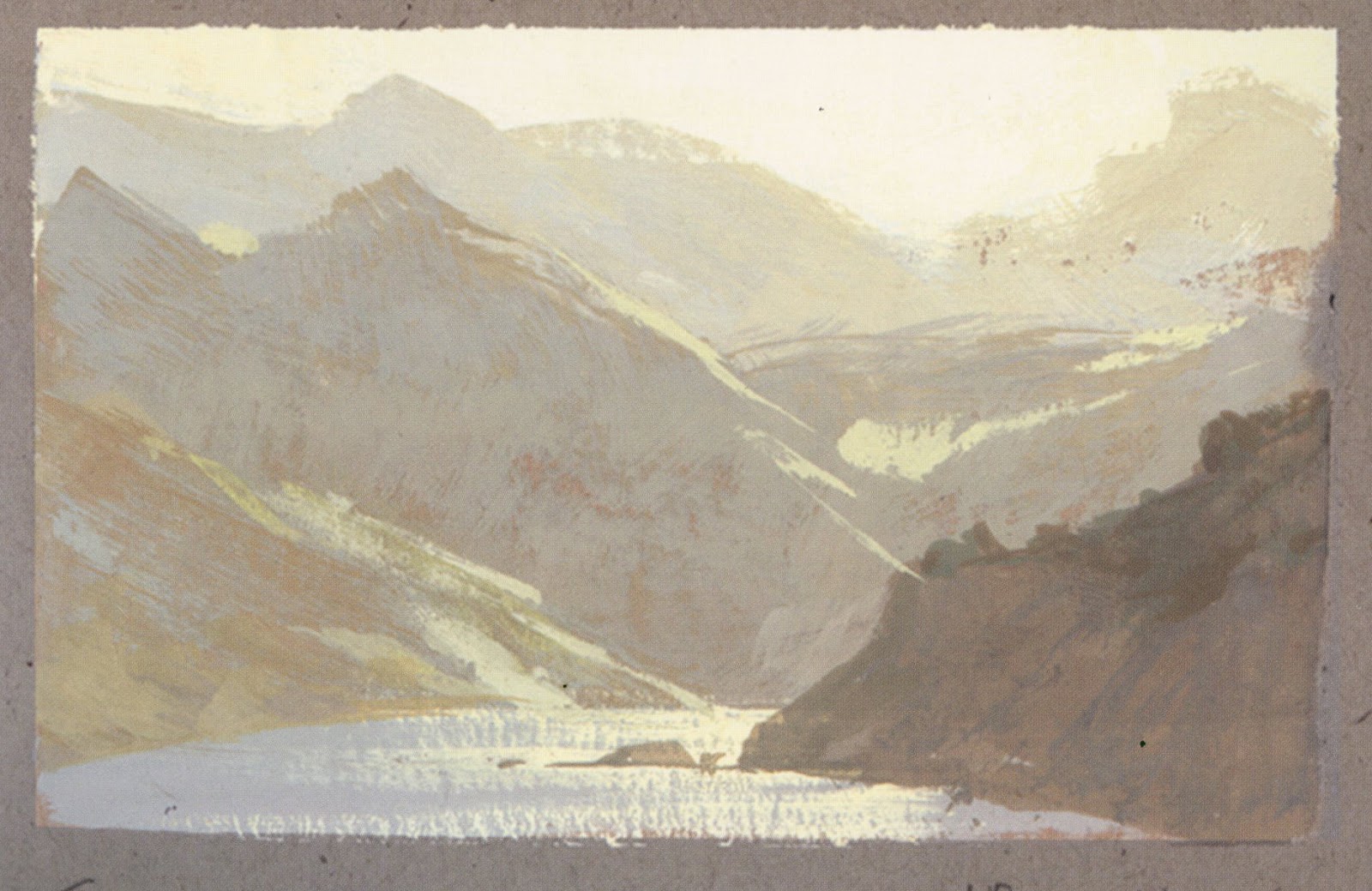
Hi Sorry if any of these are duplicate posts. These are watercolors all on yupo.


I am kind of hesitant to state any critiques as this is not a painting forum, where people post to receive the good and bad of their works.
I am kind of hesitant to state any critiques as this is not a painting forum, where people post to receive the good and bad of their works.
But i would say to get more depth in your work, i would suggest to have more of a separation of color/value from the closer areas on the picture plane to the areas farther back in the picture plane.
If you are looking for a more atmospheric feel to the work, which is how life scenes look in actual life. Created distance in the work, even if a photo reference is not showing that effect.
Nathan Fowkes[/QUOTE
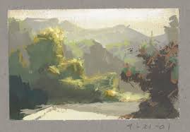
Sorry for the late response! Great suggestions for creating atmosphere!. I know of landscape painters who add grey to every color mixture to reduce the saturation and promote that hazy aerial perspective. It's tricky with watercolor on yupo since the surface is so slippery and its easy to reactivate the watercolor if trying to overpaint. I just ordered Derwent Inktense Ink sticks which mix with water but are permanent when dry, so hopefully they will give me more options with the yupo. They are a little like watercolor pans and are activated by water but turn into permanent ink when dry. They can also be used like alcohol ink when activated with alcohol instead of water. Thanks again for the observations and advice.That line of red trees is great. And I like how the sky in the background picks up some of the red as well.
The road through the mountains is also good. The yupo really gives a distinct look with the rocks. Because it sits on the paper the brush strokes are always a big part of these.
My wife was struck by the differences in the effect with yupo, and enjoyed the pieces, especially the textures.
