Occams Barber

Newbie
Site Supporter
Aug 8, 2012
6,291
7,430
75
Northern NSW
✟988,187.00
Country
Australia
Faith
Atheist
Marital Status
Divorced
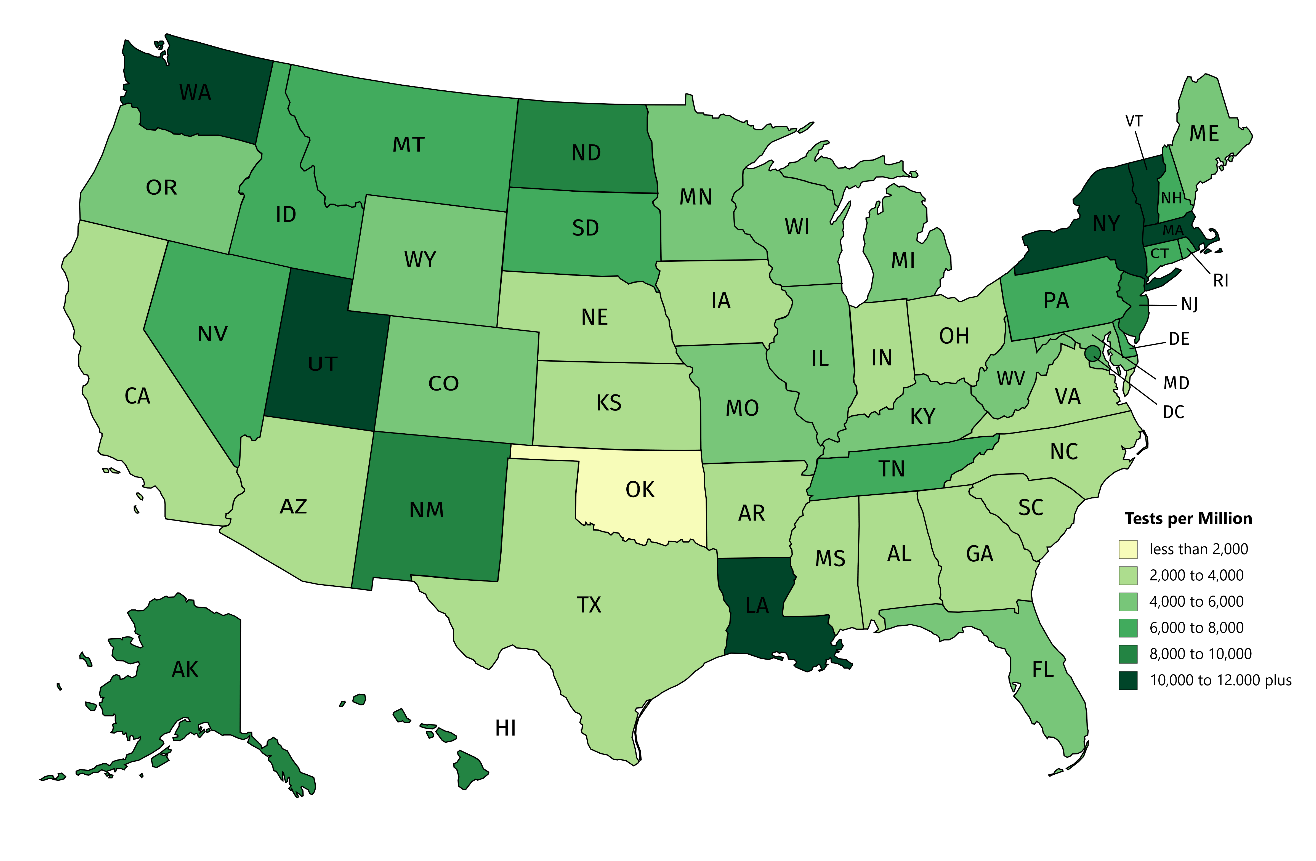
Earlier today I was playing with heatmaps. As an exercise, I used current Worldometer data, on Coronavirus testing in each US state, to build a heatmap showing relative testing per million (tpm) across the country.

Since I'm not American I can't readily recognise any patterns related to low or high testing states. Those of you from the US may see something in the map.

The range of testing rates is huge; from 678 up to 15,408. Average tests per state is around 6000 tpm. The lowest state is Oklahoma with 678 tpm. At the high end New York has tested 15,408 while Washington and Louisiana are each doing well (on tests) with 12,052 and 12,935 respectively.

Data is current at 00.56, 6 April (GMT).
United States Coronavirus: 336,830 Cases and 9,618 Deaths - Worldometer

OB
upload_2020-4-6_13-43-2.png
 
Last edited:

Occams Barber

Newbie
Site Supporter
Aug 8, 2012
6,291
7,430
75
Northern NSW
✟988,187.00
Country
Australia
Faith
Atheist
Marital Status
Divorced
At least Ok is doing ok.


OK is doing ok-ish.

The testing rate is terrible but at least the death rate and case rate (per million) is below the state average at the moment.

The low test rate could come back and bite OK in the backside if there are undetected cases of CV walking around spreading contagion.
OB
 
  • Agree
Reactions: Hank77
Upvote 0

Occams Barber

Newbie
Site Supporter
Aug 8, 2012
6,291
7,430
75
Northern NSW
✟988,187.00
Country
Australia
Faith
Atheist
Marital Status
Divorced
@Occams Barber what software you using mate?

I used an online product. After trolling the net I found an online site which I could use for nothing. Other sites I found wanted money or access to my firstborn. The one I used says:

" Internet Explorer/Edge not supported. Please use another browser"

however I managed to fiddle it by using a screen shot of the finished map and exporting it to Paint to crop off surrounding menu bars etc.

The map itself was easy to build and the results came up OK for a first attempt. The hardest bit was deciding on a sensible colour graduation.

Go here: United States - MapChart to play.

PM me if I can help - now I'm an expert. :rolleyes:
OB
 
Upvote 0

Tanj

Redefined comfortable middle class
Mar 31, 2017
7,682
8,316
59
Australia
✟277,286.00
Country
Australia
Faith
Atheist
Marital Status
Married
I used an online product. After trolling the net I found an online site which I could use for nothing. Other sites I found wanted money or access to my firstborn. The one I used says:

" Internet Explorer/Edge not supported. Please use another browser"

however I managed to fiddle it by using a screen shot of the finished map and exporting it to Paint to crop off surrounding menu bars etc.

The map itself was easy to build and the results came up OK for a first attempt. The hardest bit was deciding on a sensible colour graduation.

Go here: United States - MapChart to play.

PM me if I can help - now I'm an expert. :rolleyes:
OB

I use Tableau, Spotfire and SAS, the trick it turns out is to not have a first born. They never check.
 
Upvote 0

Occams Barber

Newbie
Site Supporter
Aug 8, 2012
6,291
7,430
75
Northern NSW
✟988,187.00
Country
Australia
Faith
Atheist
Marital Status
Divorced
I use Tableau, Spotfire and SAS, the trick it turns out is to not have a first born. They never check.


Thanks - I'll check them out.

BTW - United States - MapChart also has an Aus state map plus an electorate map should you ever desperately need it.
OB
 
Upvote 0