You are using an out of date browser. It may not display this or other websites correctly.
You should upgrade or use an alternative browser.
You should upgrade or use an alternative browser.
One chart shows everything one needs to know about Trump's approval rating
- Thread starter NightHawkeye
- Start date
It's about a chart that shows you all you need to know about Donald Trump's Approval Rating.OK. One poll says it was lower, another says it was higher.
How about we split the difference ... and agree it was about the same?")
Upvote
0
And Obama did not have an entrenched deep state financed by Soros and his international globalist bankers actively doing everything they can do destroy America and his Presidency
Maybe ... but he did inherit an economy spiraling down the drain ... and the country losing more than a half million jobs a month ...
Upvote
0
Yes, I know.Now you know that's not allowed, you have to be proven "wrong".
Still, I feel obliged to offer them the hand of friendship from time to time ... knowing full well that they will simply bite it if they can.
Upvote
0
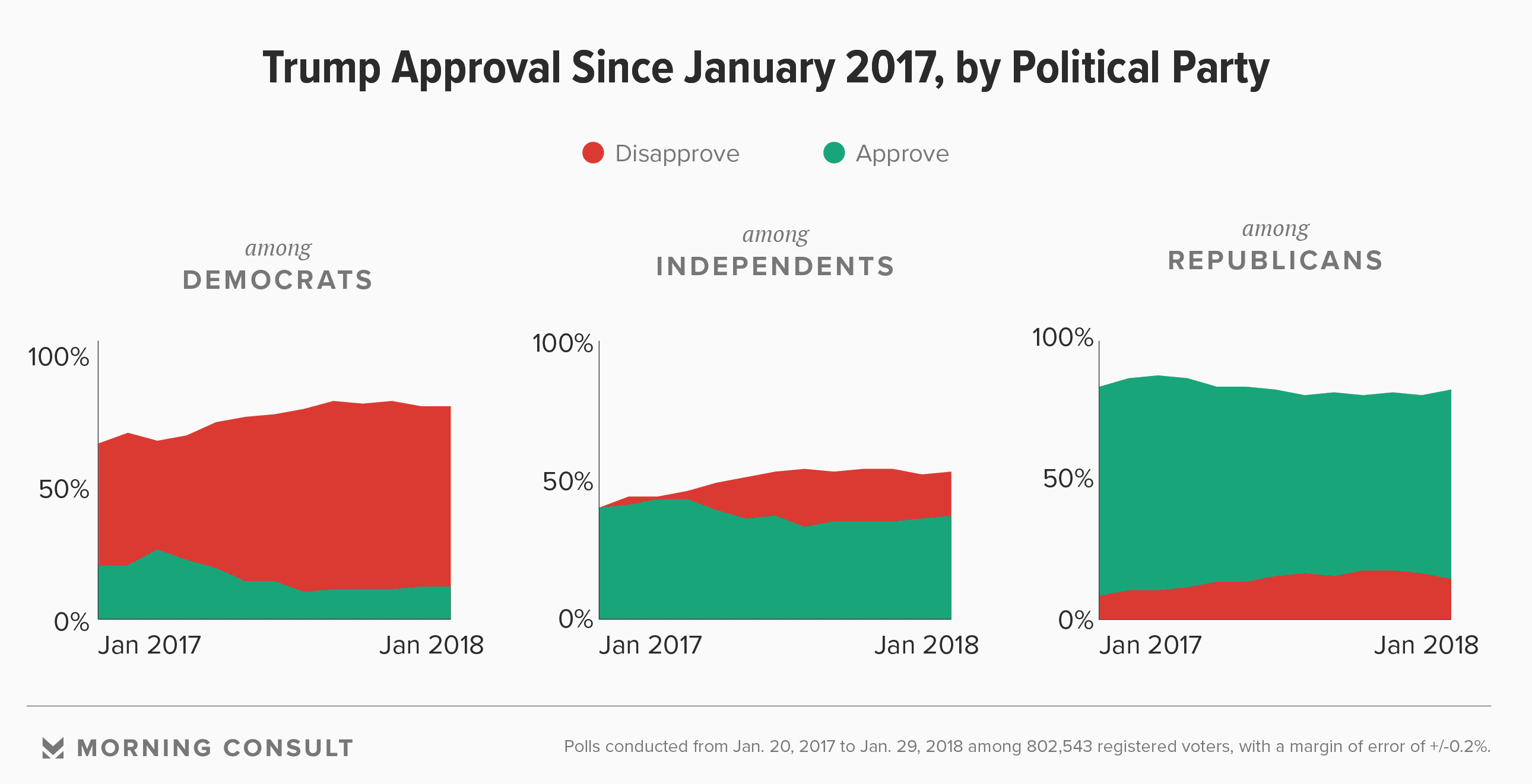
Incorrect. Note the chart legend: Red-->Disapprove, Green-->Approve
There's a lot more Green than Red ... except among Democrats.
[... and all that approval despite a persistent negative drumbeat from the mainstream press for over a year. Amazing.]
You don't seem to know how to read your own chart. In all of your charts, whatever the bottom color is actually represents both approve and disapprove. For example, Dems show about 20-25% approve with 60-75% disapprove. Independents show 45-40% approve and 45-50% disapprove. The only category in which Trump has more approve than disapprove is among Republicans.
Upvote
0
- May 29, 2012
- 41,108
- 24,128
- Country
- United States
- Faith
- Non-Denom
- Marital Status
- Married
- Politics
- US-Others
Obama Time Portal.*yawn*
We're back to 08 now are we?
Upvote
0
Remember on these forums when Obama was considered the Anti-Christ?Obama Time Portal.
Then went from Calling Obama and Dems anti-christ to trying to Destroy America LOL.
Upvote
0
- May 29, 2012
- 41,108
- 24,128
- Country
- United States
- Faith
- Non-Denom
- Marital Status
- Married
- Politics
- US-Others
‘member the Antichrist is supposed to be charming and seductive and...... wait..... obviously not Trump.Remember on these forums when Obama was considered the Anti-Christ?
Then went from Calling Obama and Dems anti-christ to trying to Destroy America LOL.
Upvote
0
This site stays free and accessible to all because of donations from people like you.
Consider making a one-time or monthly donation. We appreciate your support!
- Dan Doughty and Team Christian Forums
Blood Bought 1953
Ned Flander’s Buddy
- Oct 21, 2017
- 2,278
- 1,471
- 71
- Country
- United States
- Faith
- Non-Denom
- Marital Status
- Married
‘member the Antichrist is supposed to be charming and seductive and...... wait..... obviously not Trump.
I am checking the Scriptures diligently....so far no sign that the Antichrist will be orange......
Upvote
0
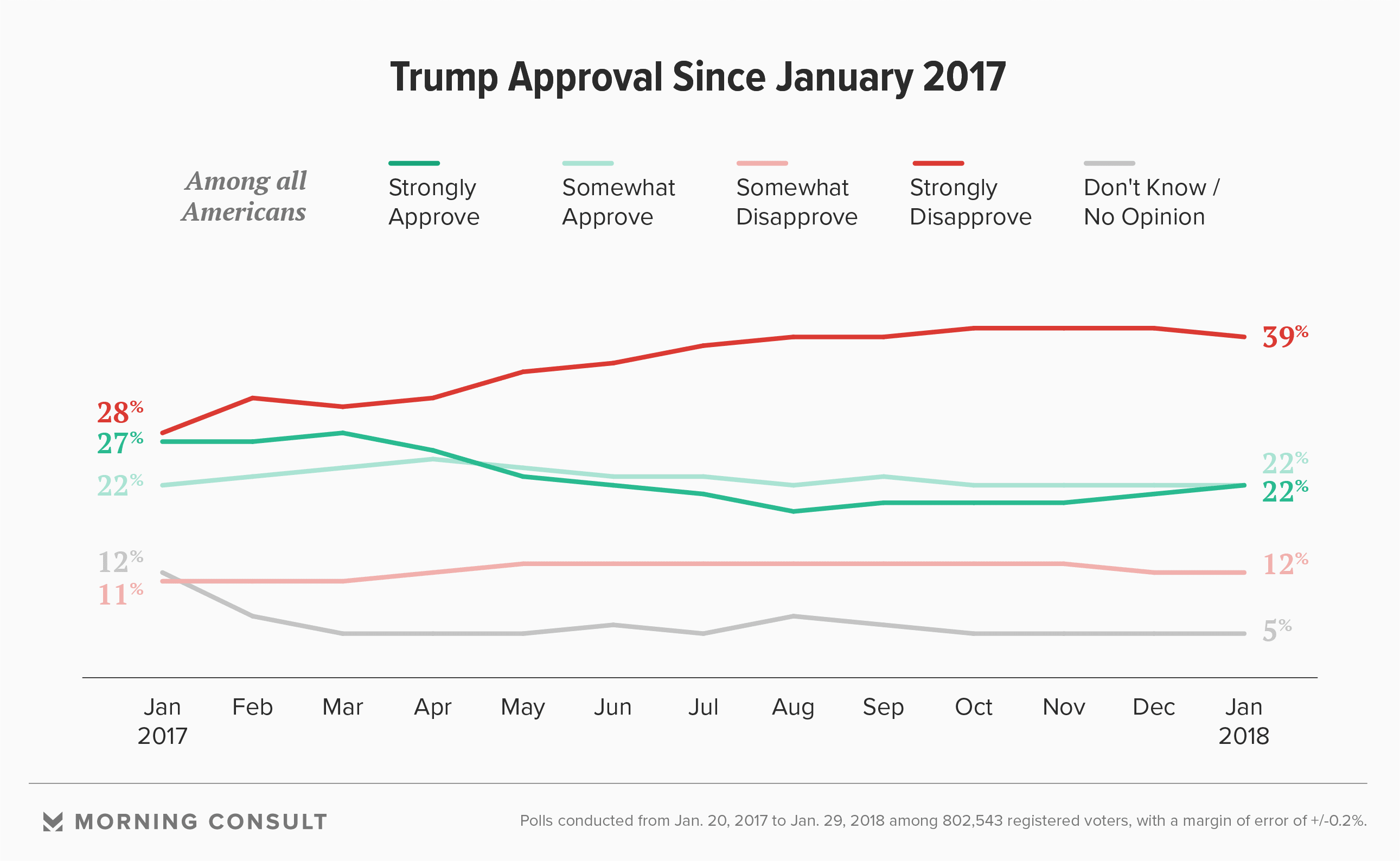
Not sure what chart you are looking at there but the chart you provided doesn't show what you claim. This shows disapproval up across the board.From Morning Consult polling: Trump Makes Gains Ahead of Midterms but Risks Remain for GOP
Haters still hatin ... but everyone else indicating approval for what Trump has done so far.
Upvote
0
Allandavid
Well-Known Member
- Dec 30, 2016
- 8,056
- 6,929
- 70
- Country
- Australia
- Faith
- Atheist
- Marital Status
- Married
And Obama did not have an entrenched deep state financed by Soros and his international globalist bankers actively doing everything they can do destroy America and his Presidency
...not to mention all those lizard people attacking at every quarter....
Upvote
0
- May 29, 2012
- 41,108
- 24,128
- Country
- United States
- Faith
- Non-Denom
- Marital Status
- Married
- Politics
- US-Others
Yes but what about the rider on the White House?I am checking the Scriptures diligently....so far no sign that the Antichrist will be orange......
Upvote
0
This site stays free and accessible to all because of donations from people like you.
Consider making a one-time or monthly donation. We appreciate your support!
- Dan Doughty and Team Christian Forums
Blood Bought 1953
Ned Flander’s Buddy
- Oct 21, 2017
- 2,278
- 1,471
- 71
- Country
- United States
- Faith
- Non-Denom
- Marital Status
- Married
Yes but what about the rider on the White House?
If trump was the antichrist he would be riding a white golf cart
Upvote
0
Grandpa2390
The Grey
- Feb 24, 2017
- 1,527
- 781
- Country
- United States
- Faith
- Non-Denom
- Marital Status
- Single
- Politics
- US-Libertarian
You mean the Independents chart shows that 40% (or so) of them approve of DJT while 10-15% or so disapprove?
That's a bizarre way to interpret that graph. It also makes no sense when you look at their other information (which pegs him as being still right at 44% approval, which is up from mid-30s, but still the lowest since 1945) . I'd bet a shiny penny that what they've done is put the red BEHIND the green, so you can see both clearly. Reading otherwise makes no sense numerically, let alone graphically.
Here's another graph from the site.
I agree with you. my first interpretation was 40% approve and 10% disapprove (for example) but that makes no sense because what about all of the white?
What they have done is put the larger percentage behind the smaller one so you can see the smaller one. if the red was put in front, you would not be able to see the green. you would think no one approved of Trump at all. lol.
essentially, More people dissapprove of Trump than approve. Except amongst Republicans.
Considering that he lost the majority vote (especially when you consider the number of people who voted for neither him nor Hillary as well), and many people who voted for him are changing their minds, and nobody who didn't vote for him has changed their minds I'm sure.... I think it is safe to say that this interpretation of the chart is correct. Most Americans don't like Trump.
Last edited:
Upvote
0
I think it is safe to say that this interpretation of the chart is correct. Most Americans don't like Trump.
At least the thread title is accurate, then.
Upvote
0
One chart shows how Trump supporters can interpret any information about Trump as a positive, regardless of what that information actually is.
Upvote
0
This site stays free and accessible to all because of donations from people like you.
Consider making a one-time or monthly donation. We appreciate your support!
- Dan Doughty and Team Christian Forums
It is positive.One chart shows how Trump supporters can interpret any information about Trump as a positive, regardless of what that information actually is.
After more than a year of non-stop unfavorable press, Trump's approval is still where Obama's was at the same time in his presidency ... despite Obama having had non-stop favorable press.
Upvote
0
Similar threads
- Replies
- 1
- Views
- 189
- Locked
- Replies
- 444
- Views
- 10K
- Replies
- 0
- Views
- 196
- Replies
- 0
- Views
- 104